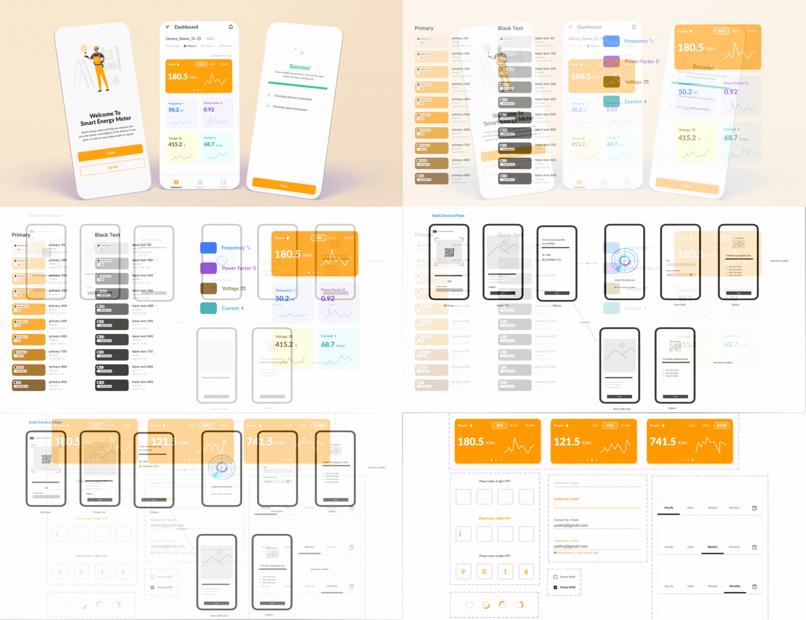


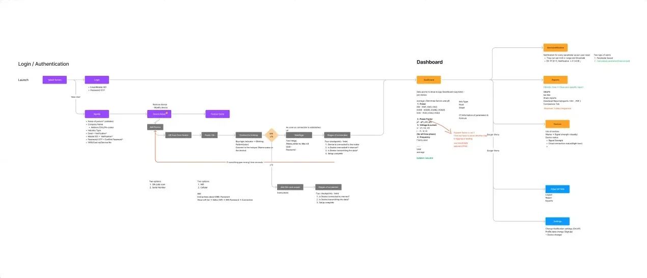
Our ideation began with creating user flows and identifying necessary steps before starting the measurement. We collaborated with the IoT engineer to understand the setup process and include all edge cases.
We created a user flow to get an idea of the initial flow of the app. The IoT engineer helped us identify and create a setup flow to connect the app to the IoT device.
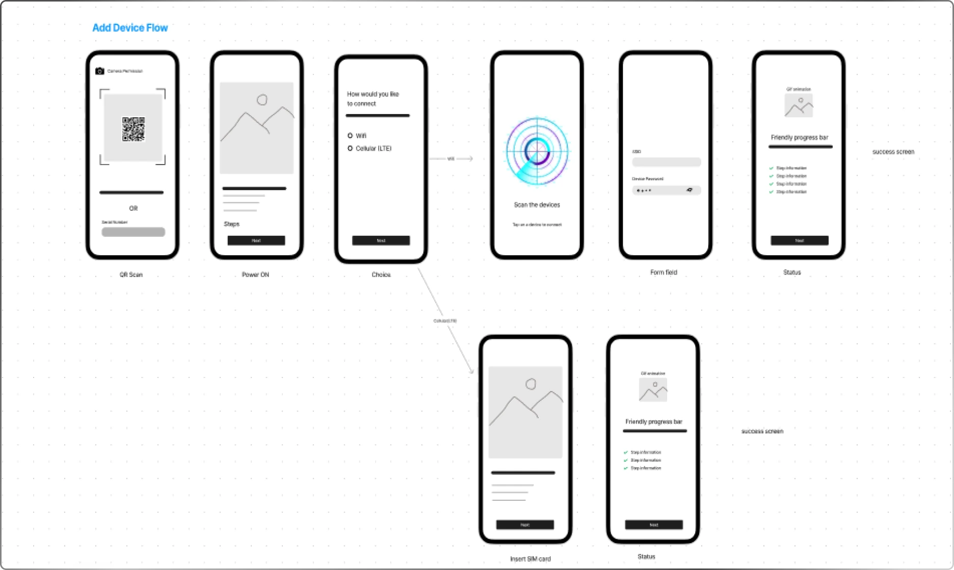
After finalizing the user flow, we started creating high-fidelity wireframes to understand the placement of each element. We created all the flows in wireframes, including all possible error cases.
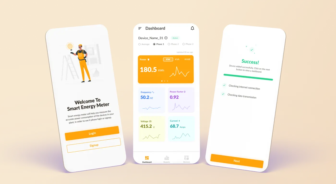
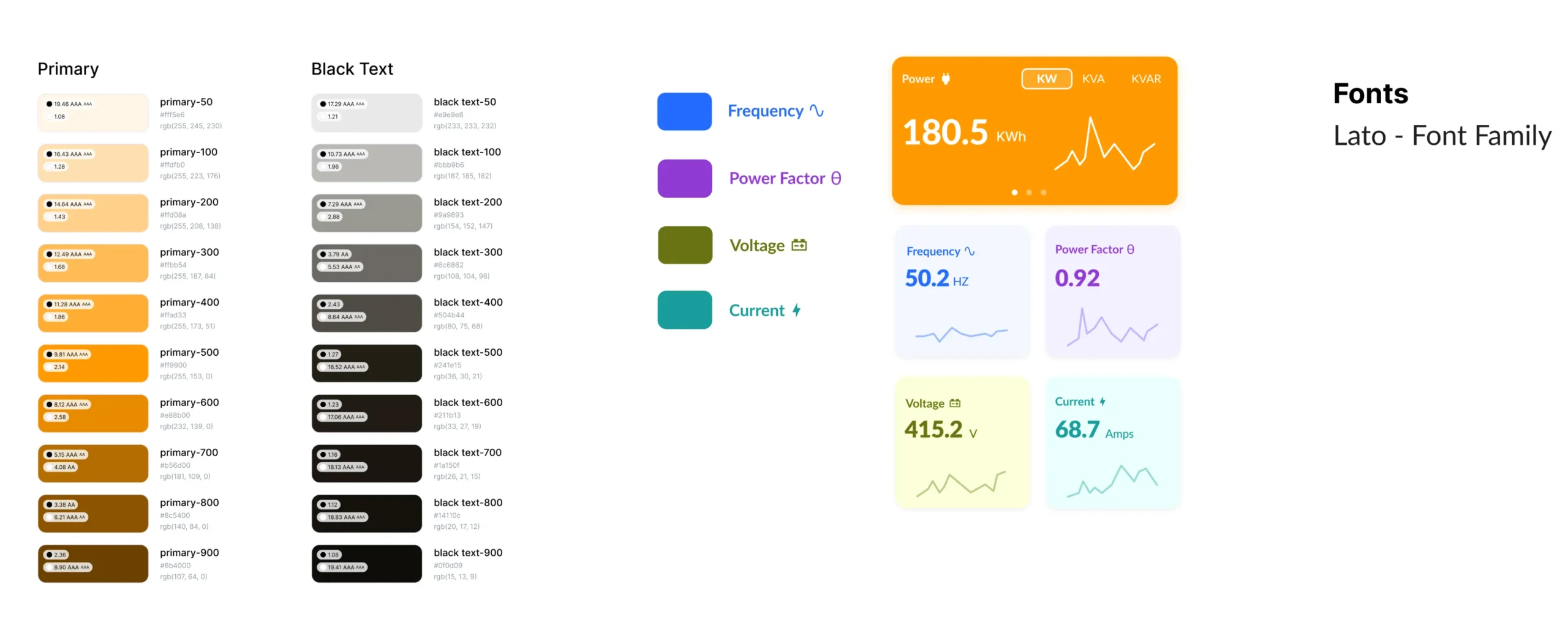
We used Bright Orange as the primary color of the application, symbolizing energy. To differentiate all units, we used five other colors. For the text, we decided to go with the Lato sans-serif font family.
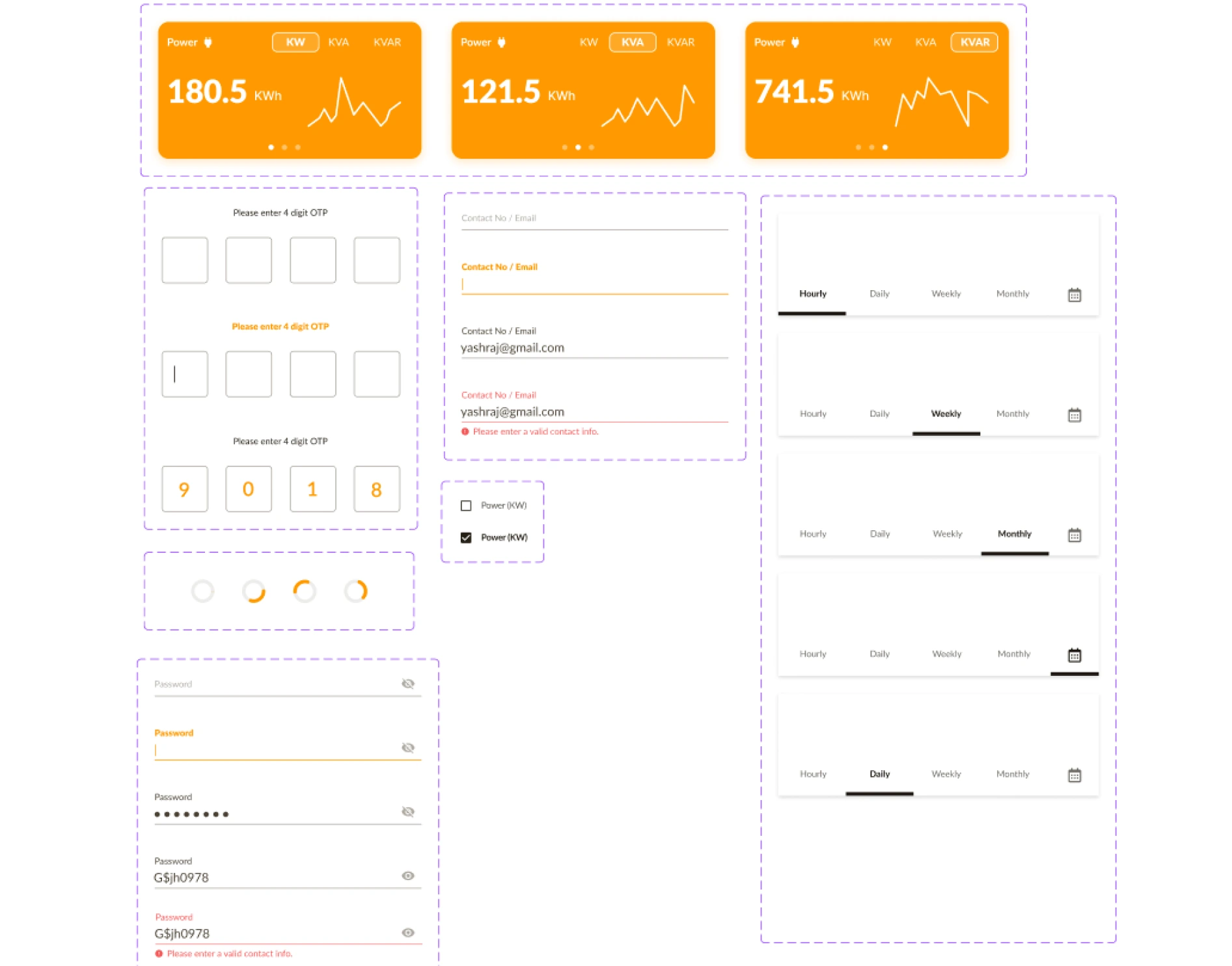
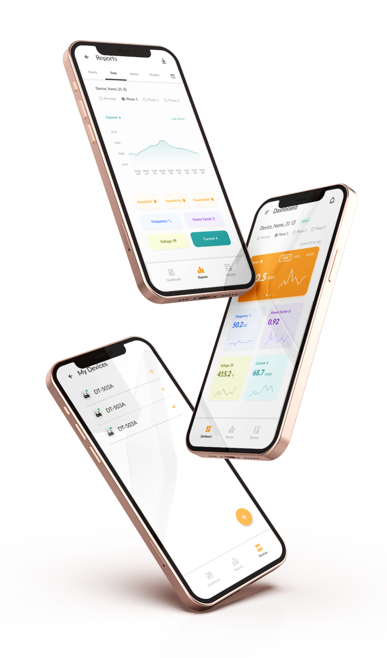
The components were designed with a strong focus on user experience, keeping in mind the overall look and feel of the app. While designing the components, all potential edge cases were taken into account. To make the user experience more engaging, animations were added to the components.
We then created a working prototype with good design and UI animation, which users could actually use and provide feedback on.
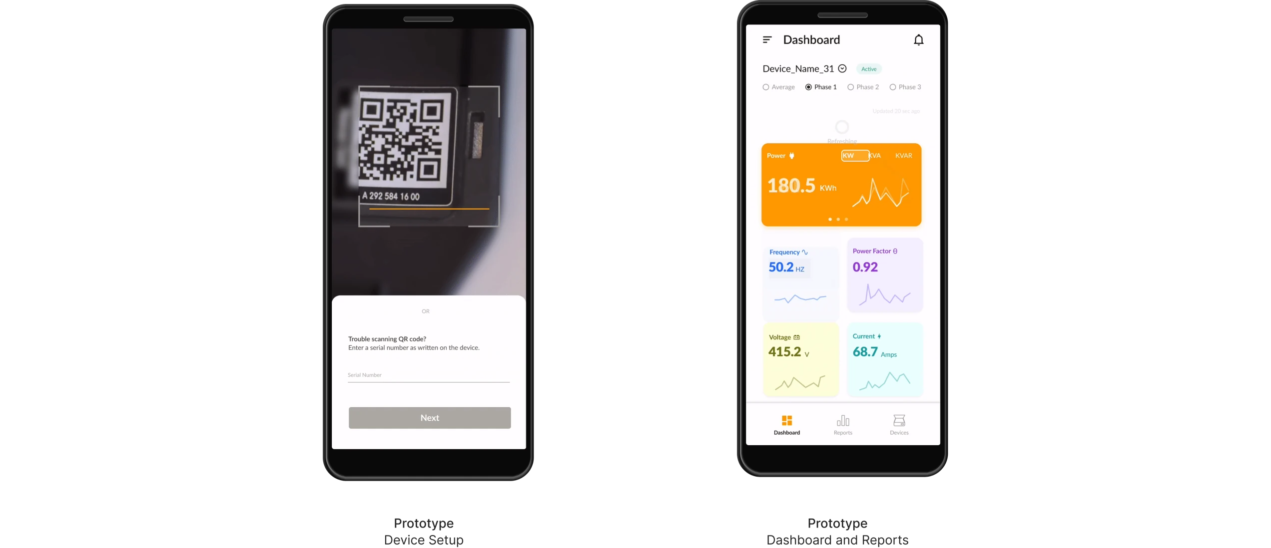
To ensure all flows are as smooth as possible, we defined usability testing in the v1 of the app and performed the following tasks on six candidates. This helped us identify areas of improvement and enhance the user experience.
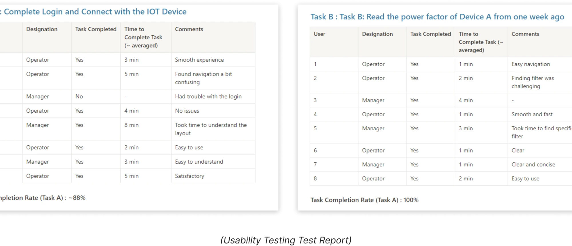

During the testing phase, network connectivity issues in the industrial environment posed a challenge. We addressed this by optimizing the app to function smoothly even in low-connectivity scenarios, ensuring that the user experience was not compromised.
– Steve Jobs
StarkSouk managed our project efficiently, responding promptly to all queries and changes. Their thoughtful recommendations, like improving product photography and packaging, positively impacted the outcome. Regular communication and client involvement ensured our expectations were met perfectly.